Zopa Blog


How to stay safe from credit card fraud: Simple steps you can take
Being aware of credit card fraud when you’re out spending is important, but there are also lots of things you can do at home to keep yourself safe too. We know that no-one likes admin, but keeping on top of these four areas could help prevent you from becoming the victim of fraud.


Zopa Bank reports first full year profit
Zopa Bank has reached annual profitability. Read about our financial performance.


The 2023 Generative AI hackathon: 48 hours of Zopian innovation
Zopa partnered with the team at Google Cloud to run a joint Gen AI hackathon. It brought together 90 Zopians to experiment and ideate with cutting edge Gen AI technology.

Who wants to be an ISA millionaire?
Is there a more realistic way to become a millionaire than winning the lottery or dreaming up a whacky invention? The short answer is *yes*, and you’d be surprised to hear that it involves ISAs. Take a look at this blog to learn the simple 4-step process that has led over 4,000 Brits to become ISA millionaires.


Taste the difference: understand the different flavours of ISA
If ISAs were ice creams🍦, how could you choose your flavour? Whether you're an experienced saver or simply dipping your toes into the savings pool, understanding ISAs — and the tax-free growth they offer — is key to maximising your savings potential. But where to start? In this blog, I delve into the different types of ISAs available to help you decide which is right for you.

Every little helps: maximising your savings with ISAs
Is it true that every little helps when it comes to savings? In short, yes! With the end of the tax year fast approaching, it’s essential that UK taxpayers understand how ISAs can help maximise their tax-free savings.
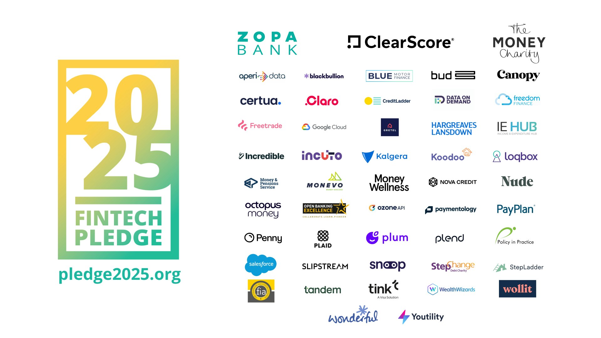
10 million actions and 50 members: 2025 Fintech Pledge achieves its goal and sets new targets
In 16 months, the 2025 Fintech Pledge has successfully fulfilled its campaign goal of 10 million actions.


An update on Diversity at Zopa in 2023
At Zopa Bank, our people are connected by purpose and a shared mission to create a fairer financial world that makes every penny count. In this blog we share an update on diversity at the company and how this changed in 2023.
